Videos

  • Is Usability the Reason You Quit That Video Game You Thought You Liked?

    Is Usability the Reason You Quit That Video Game You Thought You Liked?

    Subscribe on YouTube

    Have you ever played a game and, you wouldn’t say you’re having fun, maybe fun ish? The combat is adequately combatty. The environment is suitability environment-like. Even the story is appropriately narrative-ish. But despite all of the obvious important elements firing on just enough cylinders, something doesn’t feel right. Something isn’t quite working for you. Maybe, the game simply has poor usability.

    What is Games Usability?

    So, let’s begin with explaining what games usability is. It’s not the same as accessibility. Accessibility deals with making games playable by people with all types of impairments and disabilities, both temporary and permanent. Usability deals with making sure players understand how to play the game. Broadly speaking, accessibility is about the ability to play the game. Usability is about the ability to understand the game.

    Games usability seeks to answer three questions about a game as the player plays it:

    1. Does the player know what they have to do?
    2. Is the player able to do what they need to?
    3. Does the player know how to achieve their goals?

    A usability reviewer might investigate these questions using usability heuristics, which are rules of thumb or guiding principles. For example, a game can benefit from using real-world equivalents to indicate in-game functionality. If I, as a player, see that a gun has a long barrel and big scope, I can understand that as probably a sniper weapon and therefore its functionality can be inferred. It’s a gun that’s slow to load but good at shooting long distances. Interestingly, conventions also fold into this concept. Even if a person has never seen a real sniper weapon, if they’ve played other video games with sniper weapons, they will still understand the functionality.
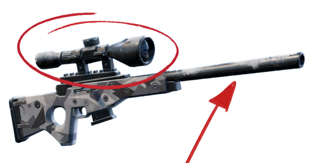
    Probably long, slow shooty. Probably not short, fast shooty.

    So, deviation from a heuristic could be enough to introduce a bit of friction between the player and the design intent of the game, that being how the game wants the player to feel and act. If the apparent sniper weapon turned out to be an automatic gun that fired mortar rounds, that would be weird. [1]Maybe awesome. But, still, weird. The player, though, might not immediately recognize this as inherently strange. Perhaps the game is set on an alien planet full of strange objects. But imagine this dissonance compounded over many hours of play with many different objects. The player may feel that something is off with the game.

    Steve Krug, in his book “Don’t Make Me Think,” introduced this idea of the reservoir of goodwill. This is the idea that users, or players in our case, will come to a game wanting to have a good experience. But each time the player experiences an issue that doesn’t make the experience great, the player’s reservoir of goodwill depletes until, if it reaches empty, the player quits the game. It’s more nuanced than that, of course, the player can build up a strong fault tolerance if motivated to continue playing through outside pressure, social pressure, emotional pressure, inertia, or simple potential (that eventual good feeling of seeing the platinum trophy pop), but the idea of usability as viewed through the reservoir of goodwill concept, can help explain the otherwise unexplainable reasons we have good enough experiences with a game instead of great experiences with a game.
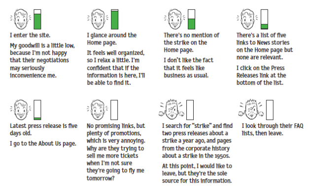
    The Reservoir of Goodwill by Steve Krug

    But video games can, and I’d argue often should, stretch, or even destroy, the heuristics as long as game usability remains. Let’s talk about this using a very common design convention and heuristic pairing. The health status icon. Usability dictates that the player character’s health, in most games, should be shown to the player any time the player needs to make decisions based on the health, which is, in many games, always. The amount of health you have remaining determines pretty much every action in a lot of games. For me, someone who’s paranoid about sudden enemy attacks at every turn, if the amount of health I have remaining is ever less than 100%, my next action is to find more health.

    Therefore , a conventional way to display character health to the player is by using a series of heart icons or a health bar, sometimes red in color, and often a corner of the screen. This placement, shape, and color has become so ubiquitous that it’s jarring when health status meters, especially in action adventure and platformer games, don’t follow at least two of these conventions.
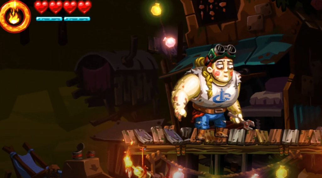
    Yeah, that feels right.

    Sometimes designers will play with conventions. World to the West, a fantastic top-down Zelda-like game, honors the color and placement conventions of the health status meter, but instead of using a common shape like a heart, circle, or a bar, World to the West uses a series of diamond shapes organized in sets of three. I admit, when I first started playing, I was a bit confused. I knew the element reflected character health, but I wasn’t sure why they were laid out like they are. Why in angled stacks of three? Ultimately, this layout had no gameplay purpose, but my confusion is worth noting as it shows just how powerful conventions can be.
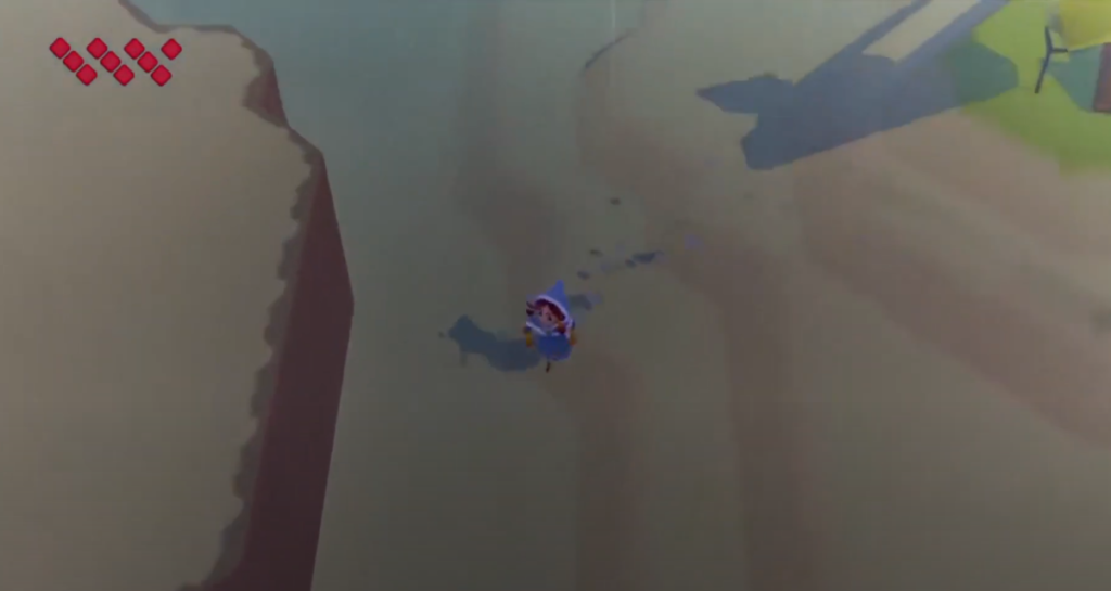
    Nope. That’s weird.

    Then, take a game like Vanquish, a third person action shooter with…a very, very atypical health status meter. The health system uses a recognizable green-yellow-red color indicator to connote full health, medium health, and low health, respectively, which is good, as the color scheme is well-known by way of most real-life traffic light systems. However, the placement of the health status meter is confusing. In fact it’s so confusing, many players have had to ask online how to even find where in the game the player character’s health status can be seen. In Vanquish, the player has to look at the player character’s suit, either at the player character’s helmet, back, or calf. All three placements are usability nightmares because they are not always in the same place, are often obscured, are hard to intentionally make visible, and making them visible compromises other systems in the game–as in, moving the camera around to view the health may mean the player isn’t able to see enemies.

    This health system status element is something that, if I were part of the development team, I would have argued for a playtest or usability review as soon as this idea made its way to the corkboard.
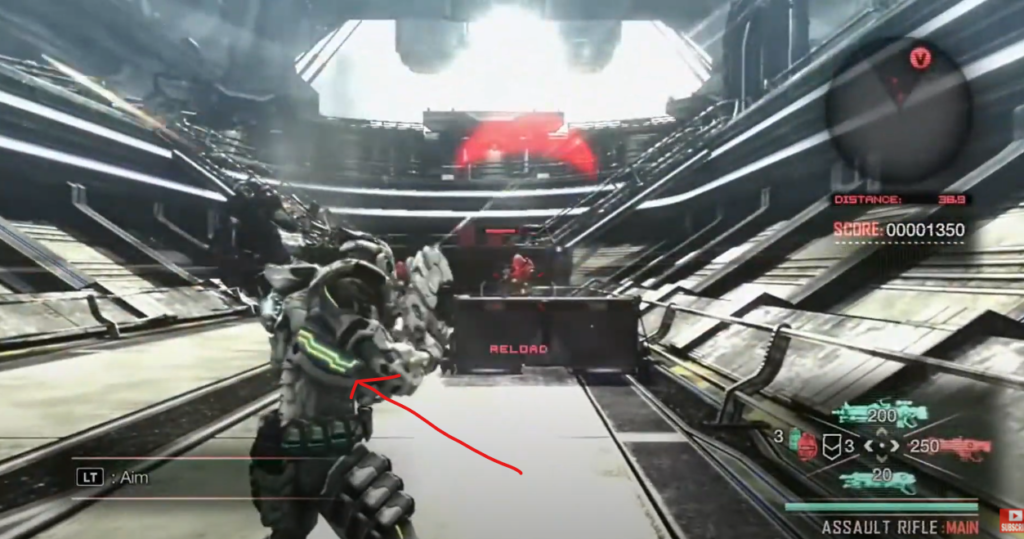
    If I have to point it out with an arrow, it is bad.

    The further a designer strays from conventions, the more they have to justify those though gameplay. Conventions are great ways to get players to focus on what a designer wants a player to focus on. People don’t have infinite ram to store every pixel and every system function in their brain. Conventions are very useful shortcuts to allow game designers to experiment and create where experimentation and creation can thrive. And sometimes, a game like Vanquish tries something new and it’s not until years later that I look back and realize, oh yeah, the health system sucked and that definitely, though subconsciously, influenced my decision to thrown that game in the trashcan.

    Credits and Mentioned:

    Music credits

    • Bossa Antigua by Kevin MacLeod, Link: https://incompetech.filmmusic.io/song/3454-bossa-antigua, License: http://creativecommons.org/licenses/by/4.0/
    • Pump by Kevin MacLeod, Link: https://incompetech.filmmusic.io/song/4252-pump, License: http://creativecommons.org/licenses/by/4.0/

    Footnotes

    Footnotes
    1 Maybe awesome. But, still, weird.
  • Are Unskippable Cutscenes a Games Usability Issue?

    Are Unskippable Cutscenes a Games Usability Issue?

    Subscribe on YouTube

    There are probably not many facets of video games more contentious than the cutscene, the short, or sometimes very long, scripted cinematic scene that, from the player’s perspective, is either a necessary piece of emotional connective tissue keeping the player tethered to the narrative or just an unwanted speed bump along a highway otherwise filled with hi-octane action. The ham-fisted solution to these opposing views is to give players the ability to skip the cutscene. Players who want it can have it. Players who don’t want it, can leave it. But as with all things related to usability, the design intent and the player perception must be taken into account. Not to mention, developers must consider the technical implications of modifying cutscene behavior. It’s not as easy as cutting out the scene.

    Player Perception on a Skippable Cutscene

    First, let’s look at the player perception angle. If given the option to simply skip all cutscenes, players may perceive that the cutscenes aren’t important, and therefore their confidence in the game’s design direction is compromised. Their reservoir of goodwill starts to deplete. Alternatively, a skipped cutscene could lead to confusion about the game’s narrative, which also could reduce player confidence in the game’s direction. The thinking would go, “why would a designer include such an intrusive yet ignorable element?” There’s some dissonance between what the game wants of the player and what the player thinks the game wants of the player.

    Technical Reality of a Skippable Cutscene

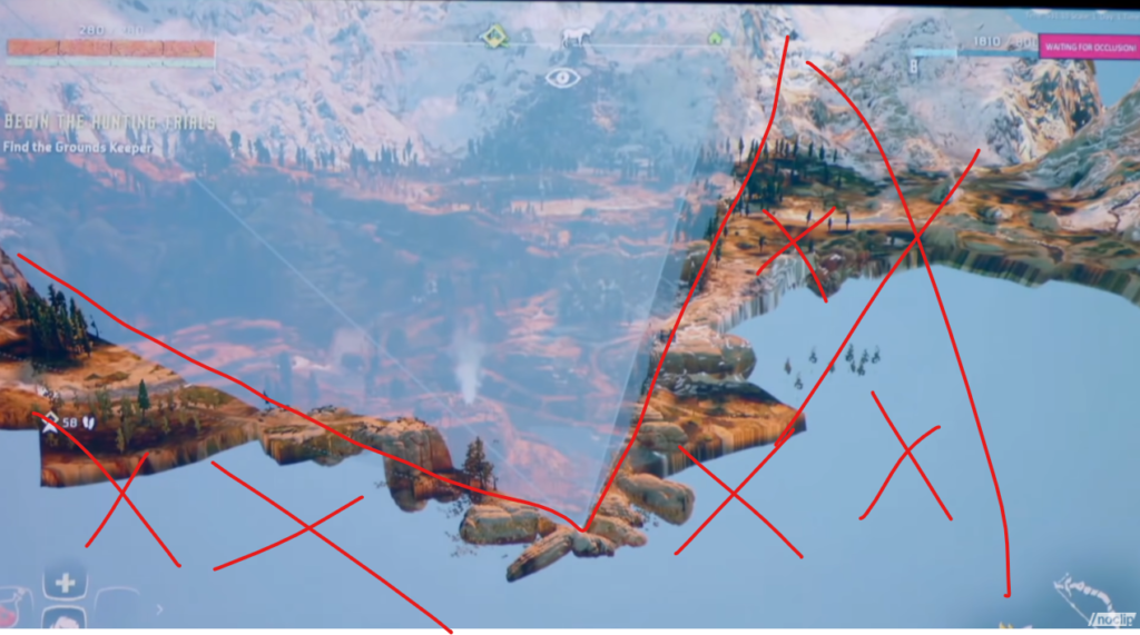
    But, skippable cutscenes, beyond just being potentially bad in practice, isn’t even possible in practice, much of the time. Video games are all smoke and mirrors, They’re just an hours long magic show where rocks are hollow and the world outside your narrow vision cone simply doesn’t exist. Cutscenes are just another pawn in the birthday party magician’s sack of tricks. For example, cutscenes are sometimes used to keep the player engaged as the game loads. In this case, they simply cannot be skipped, at least not until a certain amount of the game has been streamed in.

    Horizon Zero Dawn: What’s outside the vision cone does not get rendered.

    So if unskippable cutscenes can possibly cause player frustration. And skippable cutscenes can possibly cause player frustration. And cutscenes that are skippable midway through can possibly cause player frustration. What’s the solution? The obvious solution is to create cutscenes that are so captivating that a player happily watches them. But that’s not a reality. Different things captivate different players in different ways.

    Games Usability and a Skippable Cutscene

    First, we have to understand a bit more about how cutscenes impact game usability. Players should always be able to perceive that the system, the game, is functioning. Loading spinners, or throbbers, are a good example of this. Cutscenes can be problematic because they can reduce this transparency. These days games can look so good that players may not know a scene is a cutscene until they try to skip it. So, why not add a loading spinner. For aesthetic reasons, these types of cutscenes that mask game streaming likely shouldn’t have a giant loading spinner in the corner.

    An example of a loading screen spinner/throbber. You’ll just have to trust me that the ring in the corner is spinning.

    Perhaps game designers can leverage conventions from other, familiar interfaces. Google’s material design uses a determinant linear progress indicator which is fairly unobtrusive and could make for a good game loading indicator at the bottom of a cutscene. But I’m a games usability guy. I’m not a designer.

    A determinant linear progress indicator

    One way some designers have attempted to address this dissonance is to provide feedback when an impatient player presses a button in an attempt to skip the cutscene. Sometimes designers flash an “unable to skip cutscene” indicator. This works because it tells the user that the system is functioning but that they have to wait a bit. This gets even more potentially frustrating for players when games sometimes allow cutscenes to be skipped and sometimes don’t. The inconsistency causes unnecessary friction. I’d argue it would be better if the player knew why they were unable to skip the cutscene. Maybe “Game Loading. Unable to skip cutscene.”

    What if the cutscene is story relevant, and therefore possibly essential to the designer’s intended gameplay experience? How do you force a cutscene while also giving the player freedom? It’s a tough call, but ultimately designing around player freedom is probably the way to go. I’ve seen some games handle this by including summarizing banter between characters immediately following a cutscene. In cases where the player character has an NPC companion that was featured alongside in the cutscene, the two could comment on the content of the cutscene as the player is moving the character toward their next goal once the cutscene has passed. This way a cutscene-hater can still get the gist of the narrative, enough at least to stay invested. Good game design also reinforces recognition rather than relying on player recall. In our case, this could mean that mission names and descriptions are robust enough that a player need not watch a cutscene.

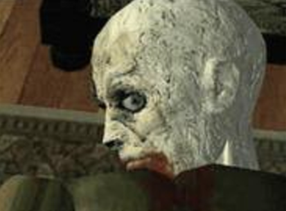
    In the early days of cutscenes, fully rendered cutscenes, rather than in engine cutscenes were all the rage. Sure they were visually jarring to the player, but we largely didn’t care because “holy crap that looks real!”. But they were impressive from a technical perspective. Not only that, but I argue they also were helpful from a usability perspective, in a strange way. The unlikely benefit to this visual incongruity between polygon-filled gameplay and smooth-rendered cutscene is that players easily understood that cutscenes were different, they looked way more impressive than the gameplay, and therefore players understood, even without overt feedback, that different rules were at play. The inability to skip a cutscene made intuitive sense. Also, remember that rendered cutscenes were still new, so many players didn’t want to skip the cutscenes because, “holy crap that looks real”.

    Yes, actual gameplay looked way worse than this cutscene in 1996.

    But now with most cutscenes happening in-engine, the visual fidelity alone between gameplay and cutscene isn’t different enough for players to let game designers get away with forcing us to watch the cutscenes, at least not without a system status indicator of some sort. It is true that the cinematic nature of cutscenes sometimes still project a sense that the rules of the game are different, but I’m not confident that’s enough.

    All of this may be moot soon though now that two of the three major consoles have SSD drives. The much faster data streaming capabilities with SSD drives means cutscenes may not be required for hiding loading screens anymore. This is a shame to me, as I personally enjoy most cutscenes, but the beneficial trade-off is that if game designers do include a cutscenes in a world in which loading is so quick it’s essentially imperceptible, I’ll know that the cutscene is intentional and for narrative purposes. And so, as a player, I’ll have greater confidence in the design direction of the game. Seeing a cutscene will be like seeing a rug in your neighbor’s living room and knowing it’s there because it actually brings the room together and not because it’s hiding a vomit stain from that time when Frank’s aged tuna salad culinary experiment turned out exactly as you’d imagine it would.

    Credits and Mentioned:

    Music credits

    • Bossa Antigua by Kevin MacLeod, Link: https://incompetech.filmmusic.io/song/3454-bossa-antigua, License: http://creativecommons.org/licenses/by/4.0/
    • Pump by Kevin MacLeod, Link: https://incompetech.filmmusic.io/song/4252-pump, License: http://creativecommons.org/licenses/by/4.0/
  • Are Button Prompts in Video Games a Sign of Bad Design?

    Are Button Prompts in Video Games a Sign of Bad Design?

    Subscribe on YouTube

    For a long time I’ve considered button prompts in video games to be an element of lazy game design. “Shouldn’t a well-designed game give players a play space so rich with affordance and feedback that players would frictionlessly and joyously discover the game mechanics and their associated inputs?” Not only did I think this, but I thought game designers were pretty universal in the idea; if button prompts can be eliminated, then shouldn’t it be done?

    But on episode 55 of the podcast “Play, Watch, Listen” Bithell dismissed the inherent goodness of an absent UI, saying it’s really just an aesthetic choice. I was surprised by this, because Mikey B is an awesome game designer and I had simply assumed every game designer would eliminate overt button prompts if they were capable enough.

    So in this video I talk about how Mike Bithell helped me rethink user interface design, specifically in regards to on-screen button prompts. Thank you, Mike Bithell.

    Mentioned:

    (more…)

  • Old Video Games Remind Me How Far We Haven’t Come

    Old Video Games Remind Me How Far We Haven’t Come

    Subscribe on YouTube

    I’ve recently been playing through the original Ninja Gaiden on the NIntendo Entertainment System (NES). Why, you may ask? Maybe subscribe to the podcast Tales of the Lesser Medium, which I co-host, and pay attention to that subscription feed. Maybe you’ll have your question answered soon…

    As I was playing Ninja Gaiden, I was taken aback by how well executed the cinematic cut-scenes are. The intro cinematic, for example, uses minimal animation to convey action, juxtaposing images to convey two ninjas in battle. Parallax scrolling, timed just right, conveys depth and increases tension simultaneously. Everything here could be done with a Powerpoint slideshow and some animated gifs, and despite the simple execution, the result is powerful.

    In all, I was surprised by the cinematic storytelling in the game. Then, I immediately questioned why I was surprised. When I play an older game, like Ninja Gaiden, for some reason I expect everything to be primitive. I expect simple level design, thin story, a few core mechanics per game each with a few verbs to expand the gameplay, and most of the time, those expectations are met. But when those expectations are eclipsed, I’m stunned, for some reason.

    I’m gonna talk about that in this video.

    Mentioned:

    (more…)

  • Can Disco Elysium: The Final Cut Teach Me to Love Keyboard Gaming?

    Can Disco Elysium: The Final Cut Teach Me to Love Keyboard Gaming?

    Subscribe on YouTube

    Disco Elysium: The Final Cut is a game I’ve been waiting for. Ever since Disco Elysium was released in October 2019 I’ve wanted to play it. However, my PC is terrible and, more importantly, I’m scared of keyboard controls. But then console ports were announced. Yay! But instead of diving right into a PS4 version of Disco Elysium: The Final Cut, I decided that the Google Stadia version is better suited for this game? Why Stadia? Watch to find out.

    Mentioned:

    (more…)

  • Maquette Makes me Feel Smart (a review of Maquette from Graceful Decay and Annapurna Interactive)

    Maquette Makes me Feel Smart (a review of Maquette from Graceful Decay and Annapurna Interactive)

    Subscribe on YouTube

    I just finished playing Maquette, an incredibly unique first person puzzle game developed by Graceful Decay and freshly published by Annapurna Interactive. Is Maquette a good game? Is Maquette fun? Watch this video review for my thoughts on the game.

    Maquette is a first person puzzle game, which is a genre I love very much. The magic of 3d puzzlers is that they must, almost by definition, introduce players to mechanics they’ve probably never seen before. Portal blew player’s minds with the portal mechanic. The Turing Test forces players to embody multiple characters. The Talos Principle relies heavily on line-of-sight puzzles. The QUBE games have players manipulate colored blocks to solve platforming puzzles. First person puzzle games are unlike any other gaming genre in that every game really must be unique. Copying platformer mechanics is common, and is seen as a sign of respecting traditions. Copying puzzle game mechanics is a lack of imagination. Maquette honors this requirement by introducing a wholly unique size-manipulation mechanic.

    (more…)

  • 10 Video Games like The Legend of Zelda that you Should Play

    10 Video Games like The Legend of Zelda that you Should Play

    Subscribe on YouTube

    The Legend of Zelda is an amazing video game series. Zelda games are always full of puzzles, adventure, exploration, and gadgets. But what other games like The Legend of Zelda series exist? What games can you play if you like the Legend of Zelda? It turns out, there are a ton of Zelda-like games out there, but for this video I’m bringing you 10 games like The Legend of Zelda that you should try. These games include: Darksider, Dark Cloud, World to the West, Sparklite, Ittle Dew 2, Hyper Light Drifter, Hob, Okami, Legend of the Skyfish, and Oceanhorn.

    (more…)