Thoughts on Game Development and Game Design. Expect quick-thought blog posts, scripted videos, and even podcasts. If you want to learn my philosophy on video game development, this is a great place to start (and end).
My game development journey has finally lead me to the world of 3D. And with 3D comes a modeling tool like Blender. I have ideas for games that could make use of such 3D modeling, of course, but honestly, as a solo dev, the world of modeling is quite daunting. Nevertheless, I felt it important to at least be familiar enough with a tool like Blender so that at the very minimum I could communicate effectively with other devs who do 3D modeling.
My very first jump into the world of Blender was, what I later learned, many first-timer’s first time jumping off point: the Blender 3.0 Beginner Donut Tutorial video series. This series is all about learning the basics, ultimately ending with rendered model of a donut. I’m happy with my attempt:
The tutorial video series introduces animation in the later videos. Here I was to animate the donut spinning at an angle along the z axis. However, my years spent learning new tools has taught me one very important lesson: motivation follows passion. So, instead of animating the donut (don’t get me wrong, I’m very passionate about donuts), I decided to try creating and animating a model of the Polymedia Network logo. In case you aren’t aware, I co-host a podcast on the Polymedia Network called Tales of the Lesser Medium. So, with an audience in mind (my co-host), I had more passion for this project and therefore knew that I’d be willing to push through when things got tough. This is the same logic that lead me to creating my Top Trumps style game using avatars from the Polymedia Discord server. Daunting project + audience I care about = motivation.
Here is the original logo:
It’s simple. The precise geometry is captivating. There’s a lot going on despite how simple it is. For example, did you recognize that the top plane of the inverted yellow cone is perfectly aligned to the bottom corner of the block? I did. Or did you notice that the space between the top plane of the cone and the inner edge of the blue cube is the same width as the edge of the cube? Well, I didn’t, as you can see in this 3D render. I wish I would have made the cube edge width more accurate to the logo. Overall, though, I’m happy with the result:
But you didn’t come here for some dumb static image. You came here for animation:
I can’t tell if the inverted cone is actually wobbly, or if that’s just a trick-of-the-eye. Maybe, it’s whatever you want it to be.
Re-use of levels doesn’t have to be boring. Narrative, along with day segments, means each environment feels very different despite their repetition. (Death Loop). Mentioned: Dishonored 2 Devs Explain the Clockwork Mansion.
Simplicity can be deceiving. Simplicity doesn’t mean boring. (Super Auto Pets).
Difficulty doesn’t make Caleb hate a game. Rather, artificial difficulty (ie, design ignorant difficulty), is what makes Caleb hate a game. (Ori and the Blind Forest).
Inscryption – A game’s mechanics don’t have to be novel in order to be worth playing or developing around
Luigi’s Mansion 3 – Puzzles should have feedback to guide the player. Meandering and luck are not satisfying game mechanics.
Doki Doki Literature Club – Video games can still be meta, even after Undertale. If the game’s conceit is unique, being meta isn’t necessarily a death sentence.
This page originated as a place to centralize all of the various resources I’ve discovered during my game development journey. However, I found it quite difficult to keep track of such an ever-fragmenting and diverging path. Because of this, the idea of a centralized resource pool was abandoned. Everything on this page is a snapshot archive from 2017-11-24 @ 19:40:09.
In September 2015 I decided I wanted to make a video game. Having no experience with game development, let alone any experience with programming of any kind, I sensed quite a daunting journey ahead of me. So I took to the internet. (more…)
I like button-mashers. Give me a retro style 2D beat ’em up or an arcade fighting game and a game controller, and I’m happy as a clam…with thumbs. A clam needs thumbs to play video games. A thumbless clam on a game controller is just a crustacean exploring a kink. I get it. I’m not shaming the clam. Or the controller. They are probably incredibly happy together.
But my happiness regarding thumbs and games is limited, specifically because my happiness is directly proportional to the skill required by said games. In other words, with 2D beat ’em ups and fighting games, I’m happy as long as I can mash buttons with relative abandon. But make me learn intricate combos, and quickly I become a sad clam. Nothing will change that.
But, people love games with crazy input combinations. And people can get really good at those games. How? Well, there are a lot of reasons, but one thing I want to focus on in this video is the idea of how really smart game designers use mental models to influence button input patterns. Basically, how do the buttons themselves, these Crosses and Squares and Xs and Ys, their colors, their relationship to each other, how do these buttons help a player to get comfortable playing a game and therefore encourage the player to enjoy the gaming experience? How can so many button combinations not feel overwhelming?
Mathematically speaking, how complex are video game move sets?
First, let’s establish a way to calculate complexity so we can measure how complexity changes from game to game. A simple equation I like to use is: Verb × nouns x context = complexity. Each verb times the count of nouns that can interact with that verb times the number of scenarios that verb can be used in, all summed together, indicates how complex a game’s move set is and therefore how complicated it could be to map all those moves to a gamepad.
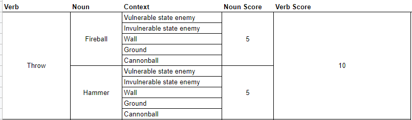
Let’s look at a game most people know, at least from my old-man perspective most people know this game. Super Mario Bros. 3 on the NES. And to make things simple, let’s look at just one verb: throw.
In the case of Super Mario Bros. 3, the number of nouns that can interact with that verb is really just two. The verb throw can interact with
fireballs
hammers.
Now, for each of those nouns, we count the number of different contexts Mario can use these verb + noun combinations.
Throwing a fireball at a vulnerable enemy kills that enemy while also snuffing out the fireball.
Throwing a fireball at an invulnerable enemy maintains that enemy while also snuffing out the fireball.
Throwing a fireball at a wall causes that fireball to snuff out.
Throwing a fireball at the ground causes the fireball to bounce forward.
Throwing the fireball at a cannonball while on one of the flying ships allows the fireball to pass through the cannonball.
I’m sure there are more interactions but let’s stop there. With this one verb x noun x context pairing, we’re at a complexity score of 5.
If we run the same equation using the hammer, we also must apply it to the same contexts as other throwable nouns, meaning we have another 5. 5 + 5 = 10.
Super Mario Bros. 3 Throw Verb Score
Altogether then the throw verb score is 10 and the cumulative complexity score is also 10, because, again, we’re only dealing with one verb in this example. If we were to take the time to account for all of Mario’s various verbs, nouns, and contexts we’d have a much higher number, but we don’t need to go further because that’s not the point here. The point is, a formula exists for showing the degree of complexity regarding character interaction mechanics.
So how is it that games like Super Mario Bros. 3 can have such a high complexity score but not actually feel that complex when playing?
Humans are really good at generating mental models. Mental models are systems of understanding the world around us. Going back to Super Mario Bros. 3 for example, the player character cannot move through green pipes. Neither can fireballs. Therefore, the player can assume that all surfaces which reject Mario world also reject fireballs and by extension would also reject other thrown nouns. These assumptions make up our mental model of the game. The beauty of a mental model is that by using one we don’t have to tax our brains with checking the behavior of every wall, every floor or every brick. Our mental model accounts for those things.
Important to note though is that mental models can adapt quite easily. Staying with Super Mario Bros. 3, the thrown hammer interacts with wall and floor objects differently than fireballs do. Having learned that, the player’s mental model adapts.
So what’s the point of all this?
I’ve been playing a lot of Marvel Spider-Man Miles Morales lately. Along with its predecessor, Marvel Spider-Man, these two games have a much, much higher complexity score than Super Mario Bros. 3. I did some quick math regarding Marvel Spider-Man Miles Morales and arrived at a complexity score of 96.
You’ll have to trust me. There are a lot of nouns and verbs in Spider-Man games, okay!
And that’s just when considering only combat verbs and only as stand alone actions. In the Marvel Spider-Man games, pressing multiple buttons simultaneously or holding buttons for specific durations of time further stretch what our verbs can do meaning the true complexity score would be exponentially higher, and I didn’t feel like trying to calculate it, so you’ll just have to trust me on this quest.
But despite this complexity the game doesn’t feel that complex when playing. Control inputs feel intuitive. Character reactions to control inputs behave in an expected manner.
How do game designers take games with such a high degree of input complexity and make those games feel intuitive?
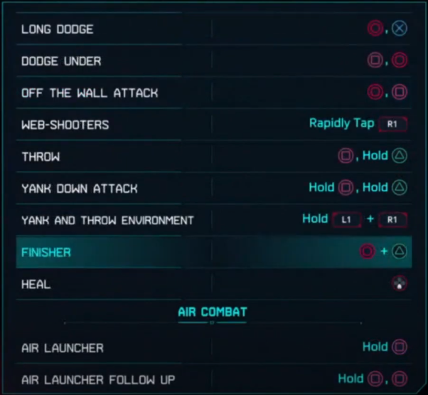
The Marvel Spider-Man Games use a lot of different techniques to inform the player’s mental model. For example, the environment itself leverages constraints to highlight when contextual actions are relevant. Such is the case with the zip-to reticle which is only visible when that action is possible.
The zip-to reticle never outstays its welcome.
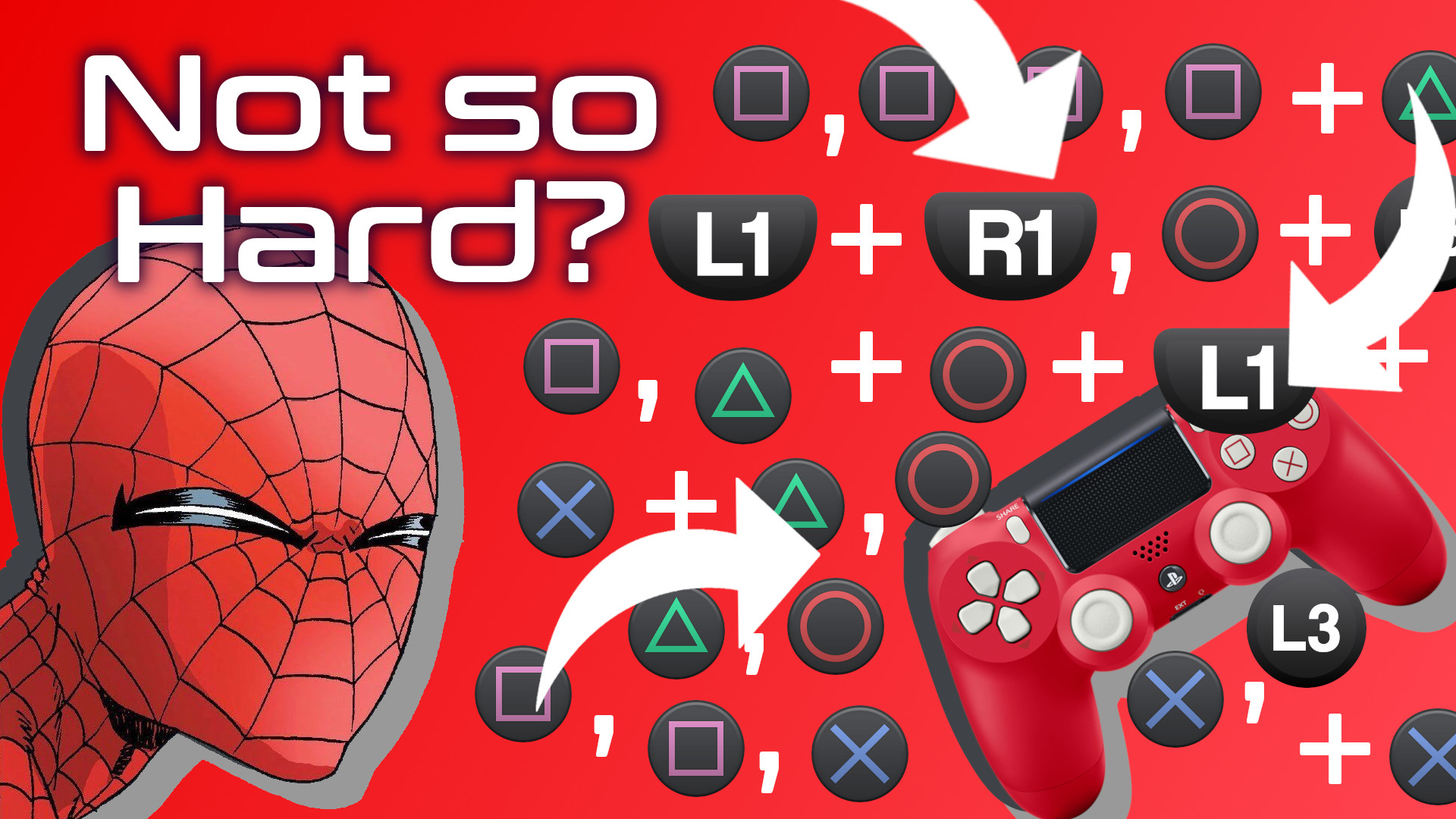
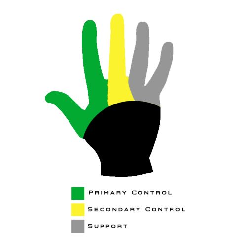
But for the remainder of this video, I want to focus on how Insomniac games has brilliantly used the PlayStation 4 Dual Shock gamepad itself to inform our mental model.
Certain buttons own certain categories of behavior
A player cannot be expected to remember every button action and combo through rote memory. Look, there are a lot of combinations. Pressing Square a bunch of times in a row is easy enough, but what about Circle then Cross or Square then Circle, and what about throwing L1 into the Square + Cross mix. On paper, it seems things could get quite complicated.
And this is just one a portion of the move set!
So how do they do it? In part, Insomniac games has designed button inputs to own categories of behavior. The player learns that the Triangle button, for example, is used to close gaps. Pressing triangle near an enemy will always serve some some of “gap closing” action, in one of the following ways:
by pulling the enemy close to Spider-Man
by pulling the enemy’s weapon close
by pulling Spider-Man toward the enemy.
The game never explicitly tells the player that the Triangle button can be thought of as a gap-closing button. Rather, the game simply tutorializes specific use cases, such as “tap Triangle to perform a web-strike.” And with consistent use and feedback, the player begins to intuit this gap-closing functionality, and once it becomes part of the player’s mental model, it becomes easier to understand how the Triangle button will impact other categories of behavior owned by other buttons. So matter what, if the triangle button is used in combination with another button, there will be some element of gap-closing. The player only needs to remember a button’s general domain, not every possible combination that uses that button. It’s pretty incredible what Insomniac has done.
This works for all of the face buttons. The Circle button is used for creating distance, most often as a dodge. The Cross button is used for jumping. The Square button is used for offensive maneuvers, mostly kicks and punches. And the L1 button is used to trigger special Venom powers. Therefore, as long as I have a general idea of what I want Spidey to do, I can do so consistently and confidently without having to rely on rote memorization.
And, since we’re on the topic of Venom powers, let’s explore the second way Insomniac uses the gamepad to inform our mental model.
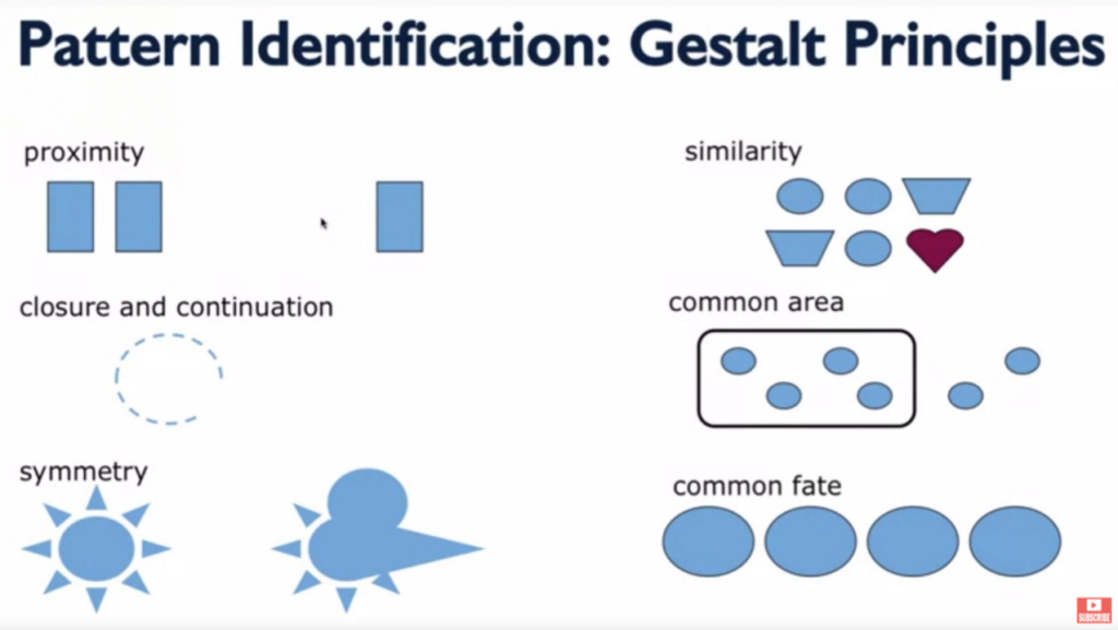
Gestalt Theory
There’s a theory of design called Gestalt Theory which factors in six individual principles: similarity, continuation & closure, proximity, common area, symmetry, and common fate. Essentially, these principles help users understand the relationships between various elements.
What’s important for us is that the formal differences between buttons as well as the proximity some buttons have helps the player understand how those buttons work together or don’t work together.
Shoulder buttons, for example, are physically distant from face buttons, they are different shapes, and on some gamepads they have different textures. Gestalt principles of design clue the player into the functional differences of these button groups. Smart game designers lean into that mentality. They don’t fight against it. It’s also worth noting that the limitations of the human hand also factor into which buttons will own which functionality.
Human hands are great…but not that great.
That’s why with Marvel Spider-Man Miles Morales the face buttons are the only buttons that affect Spider-Man’s positioning and hit-box, in most contexts. The shoulder buttons change the player’s perspective of Spider-Man or his appearance, but they don’t actually change his position, in most contexts. Similarly, the d-pad controls don’t move Spider-Man, rather they augment him in some way. Each group of buttons owns generally exclusive behaviors.
There’s also a balance that Insomniac has to maintain between honoring Gestalt principles and honoring the conventions that gamers expect. Thankfully, because smart designers have been designing smartly for years and because those designers likely know of Gestalt principles, there’s considerable overlap between what the player has come to expect based on playing lots of games and what Gestalt principles indicate the player probably expects.
Once the player’s mental model adapts to the understanding that face buttons function differently than shoulder buttons, and those in turn function differently than d-pad buttons, the player’s experience starts to feel intuitive. And remember, the game never explicitly tells the player about these functional categorizations. Smart design simply reveals it to the player. That’s incredible.
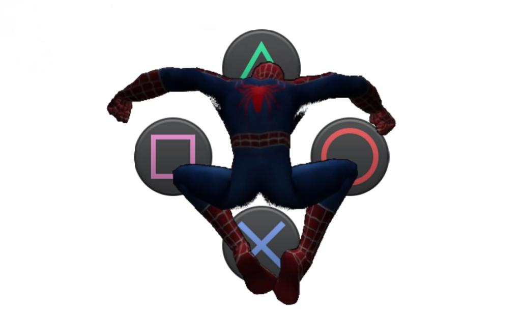
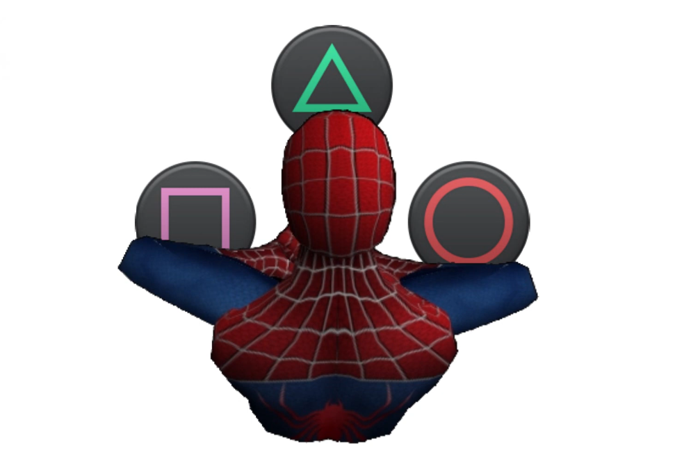
Lastly, and I’ll admit, this one is a bit of a stretch, the face buttons, the buttons that physically move Spider-Man most often, are anthropomorphic.
Anthropomorphic Button Layout
In other words, the face buttons take on the same human-like characteristics as does the human-like Spider-Man. Imagine this, you take the PlayStation 4 Dual Shock controller face buttons and overlay them with an image of Spider-Man. It would be reasonable, then, for a player to begin to understand the t-shape of the face buttons as mapping rather elegantly to the t-shape of a human body, or in this case the compressed, lower-case t-shape of spiderman perched on something. Through that lens, the cross button makes sense for an action that involves the feet, an action like jumping. Circle makes sense as a means for pushing Spider-Man away from the center axis of his body, much like a dodge would do. The Square button makes sense as a punch button specifically, but an attack button more generally, and the Triangle button, being at the top, makes sense as a means for bridging gaps, especially if you think of the face buttons from an overhead perspective, in which case triangle would be the button between Spider-Man and an enemy.
You can’t unsee it.See, the Triangle really is supposed to be a view cone.
And much like the Gestalt principles mentioned earlier, anthropomorphizing the face buttons has the added benefit of adhering to conventions. With PlayStation games, Cross is generally mapped to jump and Circle is generally a cancel button, and dodging feels like a cancel-style maneuver, as in I’m wanting Spider-Man to cancel out of whatever confrontation he’s in the middle of.
Like I said, that last method about anthropomorphizing the face buttons may be a bit of a stretch, but I think it makes sense. In fact, I dream of a day I could ask the designers at Insomniac games if there’s any truth to my hunch.
During a recent usability review playtest of an in-progress video game, I noticed something strange about the way the main menu registered gamepad inputs. This led me down an especially nerdy path to better understand what was going on.
I recently conducted a usability and gameplay analysis of an in-development game called Dungeon in a Bottle. It’s a 2D precision platformer and is absolutely delightful.
One focus of my analysis was the menu system. The developer, Very Handsome Games, called specific attention to the menu system as something they’d like me to take a look at. So I did. I look at things that people want me to look at. It’s who I am. It’s also why driving down a billboard-filled highway can be dangerous for me and any of my passengers. Billboards are meant for looking at.
When you’ve been playing video games with an eye toward usability for as long as I have, you start to intuit things on a gut level without having to rely on a checklist of usability heuristics. In the case of the Dungeon in a Bottle menu system, something felt a bit off. But I couldn’t articulate it, so I kept on with my play session. Later in the game, I noticed that a particular mechanic, called a Moth Jump, depended on button presses during specific intervals of time that, for some reason, perhaps my own ineptitude, I couldn’t quite land consistently.
The issue I found with the menu system is that when changing from one menu item to another using a gamepad it was possible, and actually quite common, to cycle so quickly through the menu options that landing on a specific option was difficult.
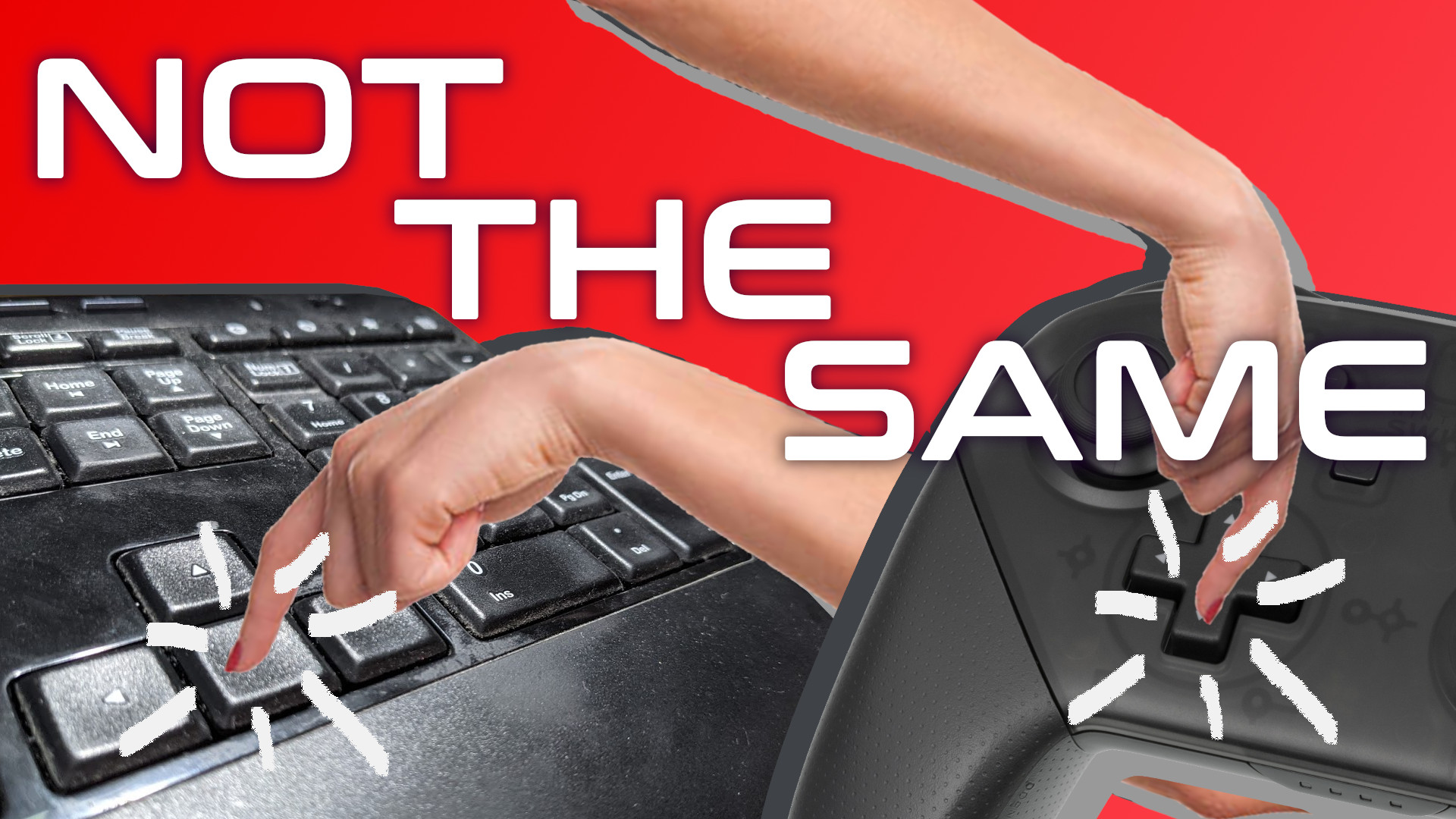
So, I had a theory worth testing: Are gamepad button presses less instant than keyboard button presses? Do players tend to hold gamepad button presses longer than keyboard button presses for the same objective?
Well, first I wanted to better understand Dungeon in a Bottle’s own playtesting measures. I reached out to the developer and asked them to validate a hunch that the game’s testing so far had been focused on keyboard input. They validated this hunch. Nice.
Validation feels nice.
But a hunch alone wasn’t enough. I needed data. So, I mocked up a menu system to test this theory. I used a menu system both because that’s the situation that initially churned my gut, but also because it’s a testing environment that eliminates skill-based variables. I needed to remove as many variables as I could because I don’t have access to a fancy lab with lots of eager test participants. No, I have access to a smelly room and just three less than eager family members.
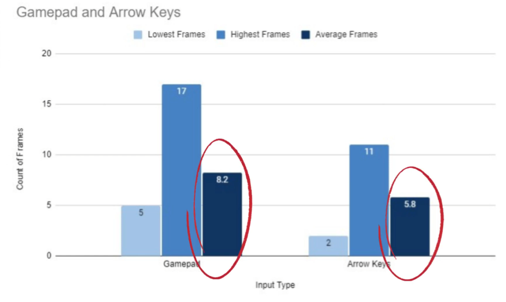
So, I have the test environment, I have the testers, and with a quick script to count frames during button presses, I have my data stream. Each session went like this: I had the player sit in front of the screen. I then instructed them to pick up the controller. I told them that the d-pad should be used for this test. I wasn’t testing how intuitive the interface was, afterall. I was testing for frame counts. So I felt comfortable directly telling the player how to navigate the menu. I then gave them a simple set of instructions to follow. For example, go down to the exit option. Now go up to the color option, now go back down to the exit option, and on and on until the player had pressed an average of 28 buttons. I then had them do the same for the keyboard.
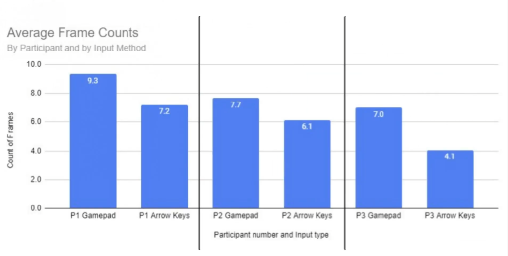
Afterwards, I had some data. Average frame counts are higher for gamepad button presses:
And this average is consistent even at the individual participant level:
Sure, this data isn’t enough to be statically valuable, but it’s definitely enough to add some credence to this idea that gamepad directional buttons tended to be pressed for longer durations than keyboard arrow keys.
Practically speaking, how is this useful? First, and perhaps most importantly, it means Bob’s thoughts about the “instant and satisfying” nature of keyboard button presses is valid from slightly more than just a subjective perspective. Second, it means that any coding in the game that relies on specific button states may need to take this input-based player behavior into account. Now, I have not talked with Very Handsome Games specifically about how they coded the game, so from here on out I’m only relying hypotheticals that could be applied to any game.
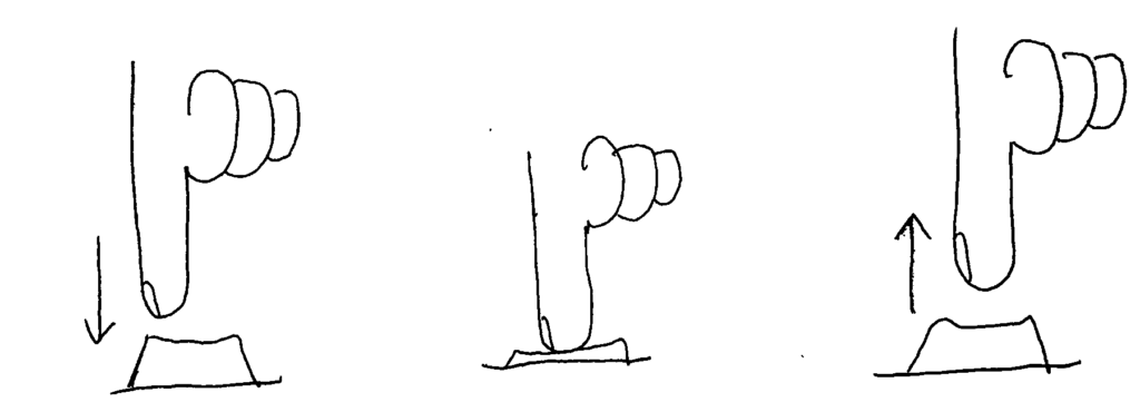
First, know that there are three states that a button can be in. In Gamemaker Studio 2, the engine that I’m most familiar with, these button states are:
check_pressed, which checks to see if the button has been pressed
check, which checks to see if the button is currently down
check_released, which checks to see if the button has been released
GameMaker Studio button states: _check_pressed, _check, _check_released
If cycling through the menu is based on the check function, then knowing that gamepad users hold buttons longer means that those players may inadvertently cycle past the desired option. Perhaps replacing this with the check_pressed function would be better, as this would allow the menu selection to advance only once per button press. However, for games with very long menus, this would force the player to press a button many times instead of just holding the button. Think the way Contra on the NES is way less problematic when using a turbo button. In this scenario, the check_pressed function is probably the right way to go, but some additional logic might be called for Perhaps the developer would want to incorporate a timer to allow the selection to advance only after a set number of frames has passed. According to the lowest frame count capture for a gamepad in my study, that number would be five frames. The developer could also have these rules be separate for gamepad and keyboard users if they really wanted to cater to specific gaming habits.
Overall, I’m really happy with this finding. Again, it’s not statically valuable, but it is incredibly interesting, to me at least, as it further helps me understand the differences between gamepad and keyboard inputs. Too often I think of the two interfaces as entirely preference based. I don’t think of them often enough as different in terms of functionality, at least not with games that are limited to very simple mechanics and few button requirements.
Have you ever played a game and, you wouldn’t say you’re having fun, maybe fun ish? The combat is adequately combatty. The environment is suitability environment-like. Even the story is appropriately narrative-ish. But despite all of the obvious important elements firing on just enough cylinders, something doesn’t feel right. Something isn’t quite working for you. Maybe, the game simply has poor usability.
What is Games Usability?
So, let’s begin with explaining what games usability is. It’s not the same as accessibility. Accessibility deals with making games playable by people with all types of impairments and disabilities, both temporary and permanent. Usability deals with making sure players understand how to play the game. Broadly speaking, accessibility is about the ability to play the game. Usability is about the ability to understand the game.
Games usability seeks to answer three questions about a game as the player plays it:
Does the player know what they have to do?
Is the player able to do what they need to?
Does the player know how to achieve their goals?
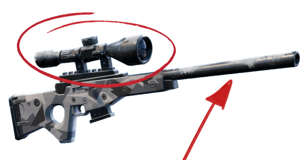
A usability reviewer might investigate these questions using usability heuristics, which are rules of thumb or guiding principles. For example, a game can benefit from using real-world equivalents to indicate in-game functionality. If I, as a player, see that a gun has a long barrel and big scope, I can understand that as probably a sniper weapon and therefore its functionality can be inferred. It’s a gun that’s slow to load but good at shooting long distances. Interestingly, conventions also fold into this concept. Even if a person has never seen a real sniper weapon, if they’ve played other video games with sniper weapons, they will still understand the functionality.
Probably long, slow shooty. Probably not short, fast shooty.
So, deviation from a heuristic could be enough to introduce a bit of friction between the player and the design intent of the game, that being how the game wants the player to feel and act. If the apparent sniper weapon turned out to be an automatic gun that fired mortar rounds, that would be weird. [1]Maybe awesome. But, still, weird. The player, though, might not immediately recognize this as inherently strange. Perhaps the game is set on an alien planet full of strange objects. But imagine this dissonance compounded over many hours of play with many different objects. The player may feel that something is off with the game.
Steve Krug, in his book “Don’t Make Me Think,” introduced this idea of the reservoir of goodwill. This is the idea that users, or players in our case, will come to a game wanting to have a good experience. But each time the player experiences an issue that doesn’t make the experience great, the player’s reservoir of goodwill depletes until, if it reaches empty, the player quits the game. It’s more nuanced than that, of course, the player can build up a strong fault tolerance if motivated to continue playing through outside pressure, social pressure, emotional pressure, inertia, or simple potential (that eventual good feeling of seeing the platinum trophy pop), but the idea of usability as viewed through the reservoir of goodwill concept, can help explain the otherwise unexplainable reasons we have good enough experiences with a game instead of great experiences with a game.
The Reservoir of Goodwill by Steve Krug
But video games can, and I’d argue often should, stretch, or even destroy, the heuristics as long as game usability remains. Let’s talk about this using a very common design convention and heuristic pairing. The health status icon. Usability dictates that the player character’s health, in most games, should be shown to the player any time the player needs to make decisions based on the health, which is, in many games, always. The amount of health you have remaining determines pretty much every action in a lot of games. For me, someone who’s paranoid about sudden enemy attacks at every turn, if the amount of health I have remaining is ever less than 100%, my next action is to find more health.
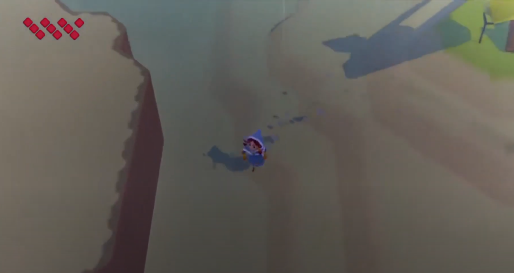
Therefore , a conventional way to display character health to the player is by using a series of heart icons or a health bar, sometimes red in color, and often a corner of the screen. This placement, shape, and color has become so ubiquitous that it’s jarring when health status meters, especially in action adventure and platformer games, don’t follow at least two of these conventions.
Yeah, that feels right.
Sometimes designers will play with conventions. World to the West, a fantastic top-down Zelda-like game, honors the color and placement conventions of the health status meter, but instead of using a common shape like a heart, circle, or a bar, World to the West uses a series of diamond shapes organized in sets of three. I admit, when I first started playing, I was a bit confused. I knew the element reflected character health, but I wasn’t sure why they were laid out like they are. Why in angled stacks of three? Ultimately, this layout had no gameplay purpose, but my confusion is worth noting as it shows just how powerful conventions can be.
Nope. That’s weird.
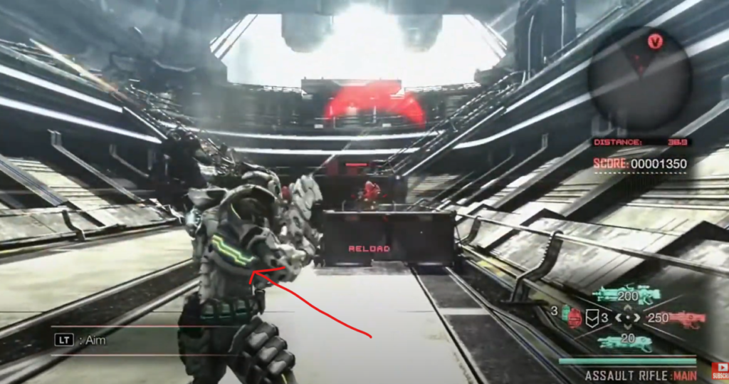
Then, take a game like Vanquish, a third person action shooter with…a very, very atypical health status meter. The health system uses a recognizable green-yellow-red color indicator to connote full health, medium health, and low health, respectively, which is good, as the color scheme is well-known by way of most real-life traffic light systems. However, the placement of the health status meter is confusing. In fact it’s so confusing, many players have had to ask online how to even find where in the game the player character’s health status can be seen. In Vanquish, the player has to look at the player character’s suit, either at the player character’s helmet, back, or calf. All three placements are usability nightmares because they are not always in the same place, are often obscured, are hard to intentionally make visible, and making them visible compromises other systems in the game–as in, moving the camera around to view the health may mean the player isn’t able to see enemies.
This health system status element is something that, if I were part of the development team, I would have argued for a playtest or usability review as soon as this idea made its way to the corkboard.
If I have to point it out with an arrow, it is bad.
The further a designer strays from conventions, the more they have to justify those though gameplay. Conventions are great ways to get players to focus on what a designer wants a player to focus on. People don’t have infinite ram to store every pixel and every system function in their brain. Conventions are very useful shortcuts to allow game designers to experiment and create where experimentation and creation can thrive. And sometimes, a game like Vanquish tries something new and it’s not until years later that I look back and realize, oh yeah, the health system sucked and that definitely, though subconsciously, influenced my decision to thrown that game in the trashcan.


 And this average is consistent even at the individual participant level: