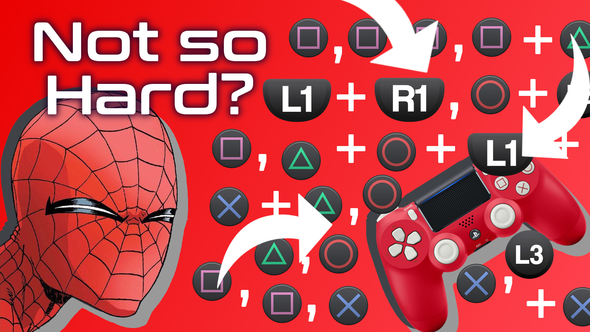
I like button-mashers. Give me a retro style 2D beat ’em up or an arcade fighting game and a game controller, and I’m happy as a clam…with thumbs. A clam needs thumbs to play video games. A thumbless clam on a game controller is just a crustacean exploring a kink. I get it. I’m not shaming the clam. Or the controller. They are probably incredibly happy together.
But my happiness regarding thumbs and games is limited, specifically because my happiness is directly proportional to the skill required by said games. In other words, with 2D beat ’em ups and fighting games, I’m happy as long as I can mash buttons with relative abandon. But make me learn intricate combos, and quickly I become a sad clam. Nothing will change that.
But, people love games with crazy input combinations. And people can get really good at those games. How? Well, there are a lot of reasons, but one thing I want to focus on in this video is the idea of how really smart game designers use mental models to influence button input patterns. Basically, how do the buttons themselves, these Crosses and Squares and Xs and Ys, their colors, their relationship to each other, how do these buttons help a player to get comfortable playing a game and therefore encourage the player to enjoy the gaming experience? How can so many button combinations not feel overwhelming?
Mathematically speaking, how complex are video game move sets?
First, let’s establish a way to calculate complexity so we can measure how complexity changes from game to game. A simple equation I like to use is: Verb × nouns x context = complexity. Each verb times the count of nouns that can interact with that verb times the number of scenarios that verb can be used in, all summed together, indicates how complex a game’s move set is and therefore how complicated it could be to map all those moves to a gamepad.
Let’s look at a game most people know, at least from my old-man perspective most people know this game. Super Mario Bros. 3 on the NES. And to make things simple, let’s look at just one verb: throw.
In the case of Super Mario Bros. 3, the number of nouns that can interact with that verb is really just two. The verb throw can interact with
- fireballs
- hammers.
Now, for each of those nouns, we count the number of different contexts Mario can use these verb + noun combinations.
- Throwing a fireball at a vulnerable enemy kills that enemy while also snuffing out the fireball.
- Throwing a fireball at an invulnerable enemy maintains that enemy while also snuffing out the fireball.
- Throwing a fireball at a wall causes that fireball to snuff out.
- Throwing a fireball at the ground causes the fireball to bounce forward.
- Throwing the fireball at a cannonball while on one of the flying ships allows the fireball to pass through the cannonball.
I’m sure there are more interactions but let’s stop there. With this one verb x noun x context pairing, we’re at a complexity score of 5.
If we run the same equation using the hammer, we also must apply it to the same contexts as other throwable nouns, meaning we have another 5. 5 + 5 = 10.

Altogether then the throw verb score is 10 and the cumulative complexity score is also 10, because, again, we’re only dealing with one verb in this example. If we were to take the time to account for all of Mario’s various verbs, nouns, and contexts we’d have a much higher number, but we don’t need to go further because that’s not the point here. The point is, a formula exists for showing the degree of complexity regarding character interaction mechanics.
So how is it that games like Super Mario Bros. 3 can have such a high complexity score but not actually feel that complex when playing?
Humans are really good at generating mental models. Mental models are systems of understanding the world around us. Going back to Super Mario Bros. 3 for example, the player character cannot move through green pipes. Neither can fireballs. Therefore, the player can assume that all surfaces which reject Mario world also reject fireballs and by extension would also reject other thrown nouns. These assumptions make up our mental model of the game. The beauty of a mental model is that by using one we don’t have to tax our brains with checking the behavior of every wall, every floor or every brick. Our mental model accounts for those things.
Important to note though is that mental models can adapt quite easily. Staying with Super Mario Bros. 3, the thrown hammer interacts with wall and floor objects differently than fireballs do. Having learned that, the player’s mental model adapts.
So what’s the point of all this?
I’ve been playing a lot of Marvel Spider-Man Miles Morales lately. Along with its predecessor, Marvel Spider-Man, these two games have a much, much higher complexity score than Super Mario Bros. 3. I did some quick math regarding Marvel Spider-Man Miles Morales and arrived at a complexity score of 96.

And that’s just when considering only combat verbs and only as stand alone actions. In the Marvel Spider-Man games, pressing multiple buttons simultaneously or holding buttons for specific durations of time further stretch what our verbs can do meaning the true complexity score would be exponentially higher, and I didn’t feel like trying to calculate it, so you’ll just have to trust me on this quest.
But despite this complexity the game doesn’t feel that complex when playing. Control inputs feel intuitive. Character reactions to control inputs behave in an expected manner.
How do game designers take games with such a high degree of input complexity and make those games feel intuitive?
The Marvel Spider-Man Games use a lot of different techniques to inform the player’s mental model. For example, the environment itself leverages constraints to highlight when contextual actions are relevant. Such is the case with the zip-to reticle which is only visible when that action is possible.

But for the remainder of this video, I want to focus on how Insomniac games has brilliantly used the PlayStation 4 Dual Shock gamepad itself to inform our mental model.
Certain buttons own certain categories of behavior
A player cannot be expected to remember every button action and combo through rote memory. Look, there are a lot of combinations. Pressing Square a bunch of times in a row is easy enough, but what about Circle then Cross or Square then Circle, and what about throwing L1 into the Square + Cross mix. On paper, it seems things could get quite complicated.
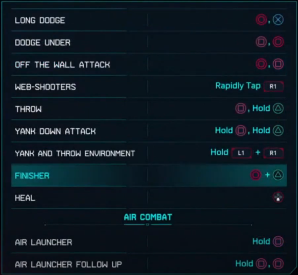
So how do they do it? In part, Insomniac games has designed button inputs to own categories of behavior. The player learns that the Triangle button, for example, is used to close gaps. Pressing triangle near an enemy will always serve some some of “gap closing” action, in one of the following ways:
- by pulling the enemy close to Spider-Man
- by pulling the enemy’s weapon close
- by pulling Spider-Man toward the enemy.
The game never explicitly tells the player that the Triangle button can be thought of as a gap-closing button. Rather, the game simply tutorializes specific use cases, such as “tap Triangle to perform a web-strike.” And with consistent use and feedback, the player begins to intuit this gap-closing functionality, and once it becomes part of the player’s mental model, it becomes easier to understand how the Triangle button will impact other categories of behavior owned by other buttons. So matter what, if the triangle button is used in combination with another button, there will be some element of gap-closing. The player only needs to remember a button’s general domain, not every possible combination that uses that button. It’s pretty incredible what Insomniac has done.
This works for all of the face buttons. The Circle button is used for creating distance, most often as a dodge. The Cross button is used for jumping. The Square button is used for offensive maneuvers, mostly kicks and punches. And the L1 button is used to trigger special Venom powers. Therefore, as long as I have a general idea of what I want Spidey to do, I can do so consistently and confidently without having to rely on rote memorization.
And, since we’re on the topic of Venom powers, let’s explore the second way Insomniac uses the gamepad to inform our mental model.
Gestalt Theory
There’s a theory of design called Gestalt Theory which factors in six individual principles: similarity, continuation & closure, proximity, common area, symmetry, and common fate. Essentially, these principles help users understand the relationships between various elements.
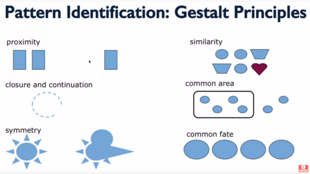
What’s important for us is that the formal differences between buttons as well as the proximity some buttons have helps the player understand how those buttons work together or don’t work together.
Shoulder buttons, for example, are physically distant from face buttons, they are different shapes, and on some gamepads they have different textures. Gestalt principles of design clue the player into the functional differences of these button groups. Smart game designers lean into that mentality. They don’t fight against it. It’s also worth noting that the limitations of the human hand also factor into which buttons will own which functionality.
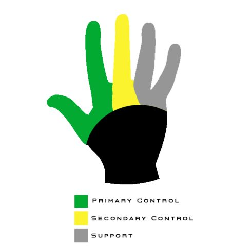
That’s why with Marvel Spider-Man Miles Morales the face buttons are the only buttons that affect Spider-Man’s positioning and hit-box, in most contexts. The shoulder buttons change the player’s perspective of Spider-Man or his appearance, but they don’t actually change his position, in most contexts. Similarly, the d-pad controls don’t move Spider-Man, rather they augment him in some way. Each group of buttons owns generally exclusive behaviors.
There’s also a balance that Insomniac has to maintain between honoring Gestalt principles and honoring the conventions that gamers expect. Thankfully, because smart designers have been designing smartly for years and because those designers likely know of Gestalt principles, there’s considerable overlap between what the player has come to expect based on playing lots of games and what Gestalt principles indicate the player probably expects.
Once the player’s mental model adapts to the understanding that face buttons function differently than shoulder buttons, and those in turn function differently than d-pad buttons, the player’s experience starts to feel intuitive. And remember, the game never explicitly tells the player about these functional categorizations. Smart design simply reveals it to the player. That’s incredible.
Lastly, and I’ll admit, this one is a bit of a stretch, the face buttons, the buttons that physically move Spider-Man most often, are anthropomorphic.
Anthropomorphic Button Layout
In other words, the face buttons take on the same human-like characteristics as does the human-like Spider-Man. Imagine this, you take the PlayStation 4 Dual Shock controller face buttons and overlay them with an image of Spider-Man. It would be reasonable, then, for a player to begin to understand the t-shape of the face buttons as mapping rather elegantly to the t-shape of a human body, or in this case the compressed, lower-case t-shape of spiderman perched on something. Through that lens, the cross button makes sense for an action that involves the feet, an action like jumping. Circle makes sense as a means for pushing Spider-Man away from the center axis of his body, much like a dodge would do. The Square button makes sense as a punch button specifically, but an attack button more generally, and the Triangle button, being at the top, makes sense as a means for bridging gaps, especially if you think of the face buttons from an overhead perspective, in which case triangle would be the button between Spider-Man and an enemy.
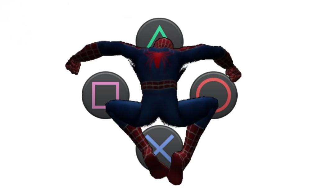
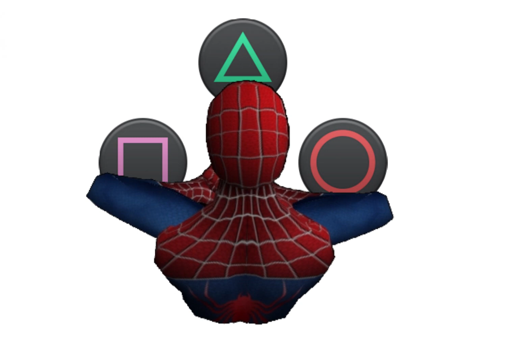
And much like the Gestalt principles mentioned earlier, anthropomorphizing the face buttons has the added benefit of adhering to conventions. With PlayStation games, Cross is generally mapped to jump and Circle is generally a cancel button, and dodging feels like a cancel-style maneuver, as in I’m wanting Spider-Man to cancel out of whatever confrontation he’s in the middle of.
Like I said, that last method about anthropomorphizing the face buttons may be a bit of a stretch, but I think it makes sense. In fact, I dream of a day I could ask the designers at Insomniac games if there’s any truth to my hunch.
Credits and Mentioned:
Designing Game Controls (article about the limitations of the human hand)
Music credits
- Bossa Antigua by Kevin MacLeod, Link: https://incompetech.filmmusic.io/song/3454-bossa-antigua, License: http://creativecommons.org/licenses/by/4.0/
- Pump by Kevin MacLeod, Link: https://incompetech.filmmusic.io/song/4252-pump, License: http://creativecommons.org/licenses/by/4.0/
