Have you ever played a game and, you wouldn’t say you’re having fun, maybe fun ish? The combat is adequately combatty. The environment is suitability environment-like. Even the story is appropriately narrative-ish. But despite all of the obvious important elements firing on just enough cylinders, something doesn’t feel right. Something isn’t quite working for you. Maybe, the game simply has poor usability.
What is Games Usability?
So, let’s begin with explaining what games usability is. It’s not the same as accessibility. Accessibility deals with making games playable by people with all types of impairments and disabilities, both temporary and permanent. Usability deals with making sure players understand how to play the game. Broadly speaking, accessibility is about the ability to play the game. Usability is about the ability to understand the game.
Games usability seeks to answer three questions about a game as the player plays it:
- Does the player know what they have to do?
- Is the player able to do what they need to?
- Does the player know how to achieve their goals?
A usability reviewer might investigate these questions using usability heuristics, which are rules of thumb or guiding principles. For example, a game can benefit from using real-world equivalents to indicate in-game functionality. If I, as a player, see that a gun has a long barrel and big scope, I can understand that as probably a sniper weapon and therefore its functionality can be inferred. It’s a gun that’s slow to load but good at shooting long distances. Interestingly, conventions also fold into this concept. Even if a person has never seen a real sniper weapon, if they’ve played other video games with sniper weapons, they will still understand the functionality.
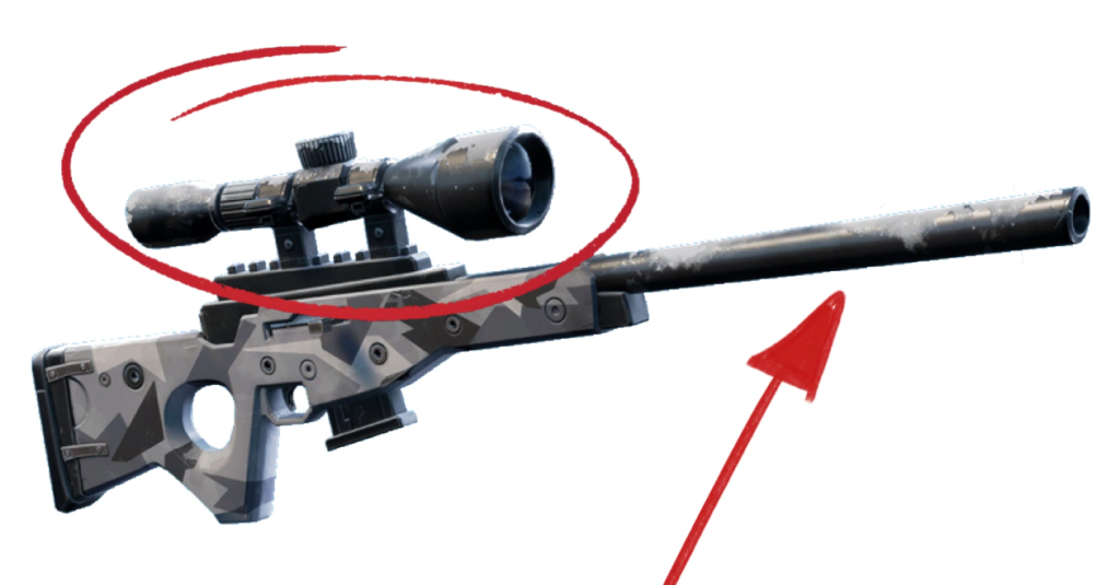
So, deviation from a heuristic could be enough to introduce a bit of friction between the player and the design intent of the game, that being how the game wants the player to feel and act. If the apparent sniper weapon turned out to be an automatic gun that fired mortar rounds, that would be weird. [1]Maybe awesome. But, still, weird. The player, though, might not immediately recognize this as inherently strange. Perhaps the game is set on an alien planet full of strange objects. But imagine this dissonance compounded over many hours of play with many different objects. The player may feel that something is off with the game.
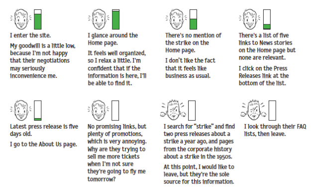
Steve Krug, in his book “Don’t Make Me Think,” introduced this idea of the reservoir of goodwill. This is the idea that users, or players in our case, will come to a game wanting to have a good experience. But each time the player experiences an issue that doesn’t make the experience great, the player’s reservoir of goodwill depletes until, if it reaches empty, the player quits the game. It’s more nuanced than that, of course, the player can build up a strong fault tolerance if motivated to continue playing through outside pressure, social pressure, emotional pressure, inertia, or simple potential (that eventual good feeling of seeing the platinum trophy pop), but the idea of usability as viewed through the reservoir of goodwill concept, can help explain the otherwise unexplainable reasons we have good enough experiences with a game instead of great experiences with a game.
But video games can, and I’d argue often should, stretch, or even destroy, the heuristics as long as game usability remains. Let’s talk about this using a very common design convention and heuristic pairing. The health status icon. Usability dictates that the player character’s health, in most games, should be shown to the player any time the player needs to make decisions based on the health, which is, in many games, always. The amount of health you have remaining determines pretty much every action in a lot of games. For me, someone who’s paranoid about sudden enemy attacks at every turn, if the amount of health I have remaining is ever less than 100%, my next action is to find more health.
Therefore , a conventional way to display character health to the player is by using a series of heart icons or a health bar, sometimes red in color, and often a corner of the screen. This placement, shape, and color has become so ubiquitous that it’s jarring when health status meters, especially in action adventure and platformer games, don’t follow at least two of these conventions.
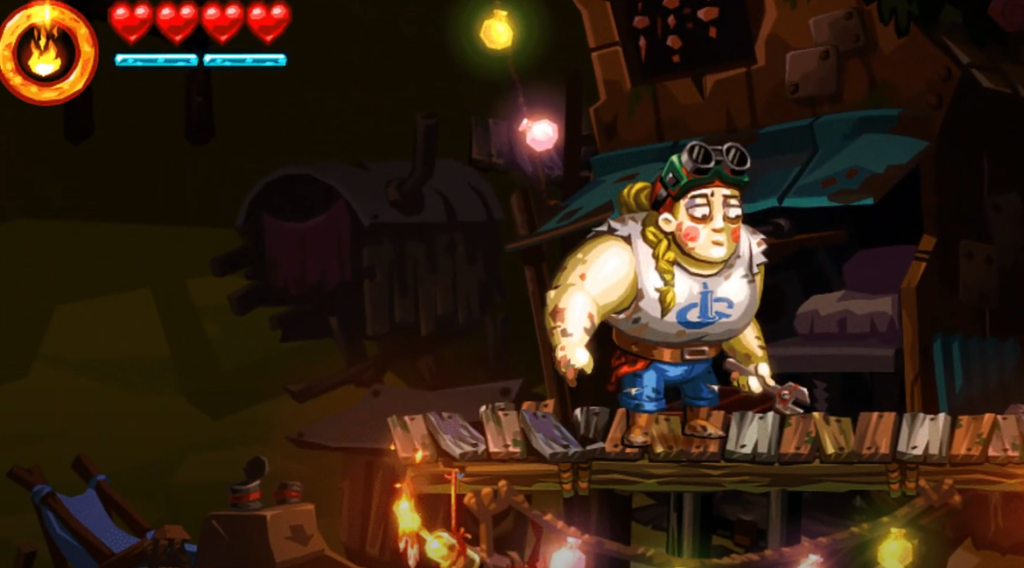
Sometimes designers will play with conventions. World to the West, a fantastic top-down Zelda-like game, honors the color and placement conventions of the health status meter, but instead of using a common shape like a heart, circle, or a bar, World to the West uses a series of diamond shapes organized in sets of three. I admit, when I first started playing, I was a bit confused. I knew the element reflected character health, but I wasn’t sure why they were laid out like they are. Why in angled stacks of three? Ultimately, this layout had no gameplay purpose, but my confusion is worth noting as it shows just how powerful conventions can be.

Then, take a game like Vanquish, a third person action shooter with…a very, very atypical health status meter. The health system uses a recognizable green-yellow-red color indicator to connote full health, medium health, and low health, respectively, which is good, as the color scheme is well-known by way of most real-life traffic light systems. However, the placement of the health status meter is confusing. In fact it’s so confusing, many players have had to ask online how to even find where in the game the player character’s health status can be seen. In Vanquish, the player has to look at the player character’s suit, either at the player character’s helmet, back, or calf. All three placements are usability nightmares because they are not always in the same place, are often obscured, are hard to intentionally make visible, and making them visible compromises other systems in the game–as in, moving the camera around to view the health may mean the player isn’t able to see enemies.
This health system status element is something that, if I were part of the development team, I would have argued for a playtest or usability review as soon as this idea made its way to the corkboard.
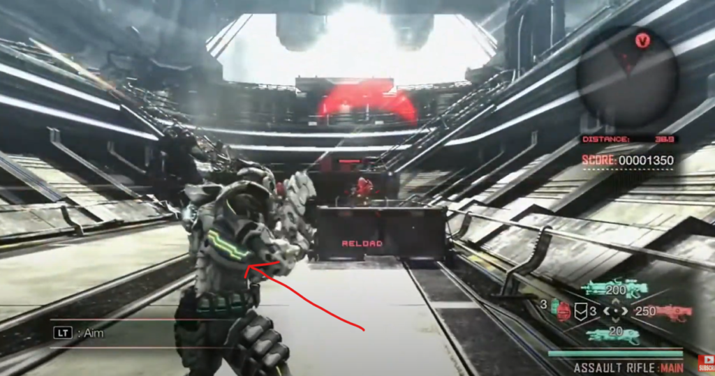
The further a designer strays from conventions, the more they have to justify those though gameplay. Conventions are great ways to get players to focus on what a designer wants a player to focus on. People don’t have infinite ram to store every pixel and every system function in their brain. Conventions are very useful shortcuts to allow game designers to experiment and create where experimentation and creation can thrive. And sometimes, a game like Vanquish tries something new and it’s not until years later that I look back and realize, oh yeah, the health system sucked and that definitely, though subconsciously, influenced my decision to thrown that game in the trashcan.
Credits and Mentioned:
Music credits
- Bossa Antigua by Kevin MacLeod, Link: https://incompetech.filmmusic.io/song/3454-bossa-antigua, License: http://creativecommons.org/licenses/by/4.0/
- Pump by Kevin MacLeod, Link: https://incompetech.filmmusic.io/song/4252-pump, License: http://creativecommons.org/licenses/by/4.0/
Footnotes
| ↑1 | Maybe awesome. But, still, weird. |
|---|
