Game Usability Review – Ratchet & Clank Future: A Crack in Time
This is a usability review of Ratchet & Clank Future: A Crack in Time conducted by Caleb J. Ross in April 2021. This usability review can be accessed in several ways:
- Video presentation (recommended method): The full presentation, presented by Caleb J. Ross, can be viewed using this YouTube link.
- Flat text: The full presentation can read in a flat (non-slides) layout below.
- Slideshow: The full presentation can be viewed using this direct link
Objectives, Considerations, & Method
Objectives
Assess the usability of the first two sectors of Ratchet & Clank Future: A Crack in Time
- Identify usability issues that will prevent players from experiencing the game as intended.
Considerations
This review was conducted and packaged by a single player. Nobody associated with the development or publication of the game was contacted or consulted with in any way.
This game was experienced under the following conditions:
- Stage: retail release, 2009 (no version number available)
- Platform: PlayStation Network, streaming over an Ethernet connection via a PlayStation 4 console.
Method
Usability Review
- The game has been reviewed to anticipate potential issues players may encounter.
- The review has been conducted using usability principles and best practices.
- The result is a list of usability issues that real players may have with the game.
- Usability reviews ask:
- Does a player know what they have to do?
- Is a player able to do what they need to?
- Does the player know how to achieve their goals?
Usability reviews are not a replacement for playtesting or quality assurance testing and therefore should be used in combination with other methods to provide a complete understanding of the player experience.
Prioritization
Issues have been prioritized based on the anticipated impact on the player’s experience, based on an adapted version of the userfocus decision tree.
| High – A persistent and/or difficult to overcome issue with a core feature that will severely impact progress. Issues regarding real-world currency or in-game equivalents are always a high priority. | |
| Medium – An issue that may be persistent or difficult to overcome but will not prevent progress. | |
| Low – An issue with a secondary feature that is not persistent or difficult to overcome but may affect players’ opinion of the game. |
Executive Summary
No high priority items were discovered under the scope of this usability review
Issues
Planet Game Space Issues
Moving platform prompts are inconsistent with their functionality |
Cause: The unfamiliar launchpad lacks a button prompt
Cause: The player has been taught that platforms without button prompts are timed, and therefore need no player input
Impact: The player is unnecessarily idle
Impact: The player is less able to anticipate behavior of future unfamiliar launchpad types
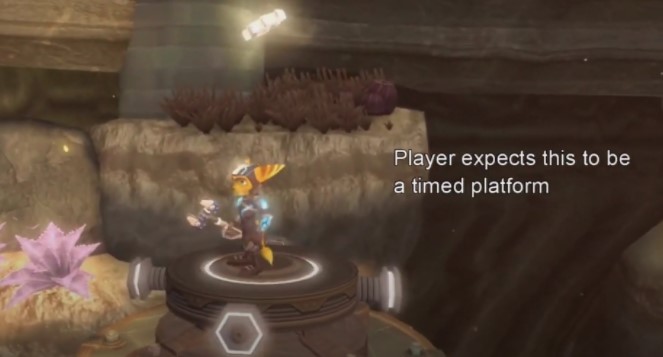
Full clip: https://youtu.be/a2hroB8vCZE
Flying Game Space Issues
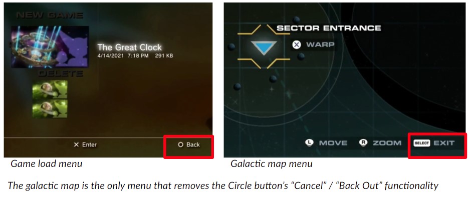
Backing out of the Galactic Map is confusing |
Cause: The Circle button is used to cancel and back out of decisions except when viewing the galactic map, where the Left Touchpad / Select is used instead.
Cause: The player has been taught that Circle is the “Cancel” / “Back Out” button
Impact: Players may press Circle to “Cancel” / “Back Out” of the galactic map according to the game’s conventions, causing frustration when not presented with the expected feedback
Landing the Aphelion on progress-gated moons wastes player time |
Cause: The “Required gadget” message appears after the non-cancelable landing animation
Impact: The player must return to the Aphelion immediately upon landing
Recommendation: Display the progress gate message concurrently with the “Press Triangle to land” (which appears before the non-cancelable animation) so that players have information to inform their decision to land.
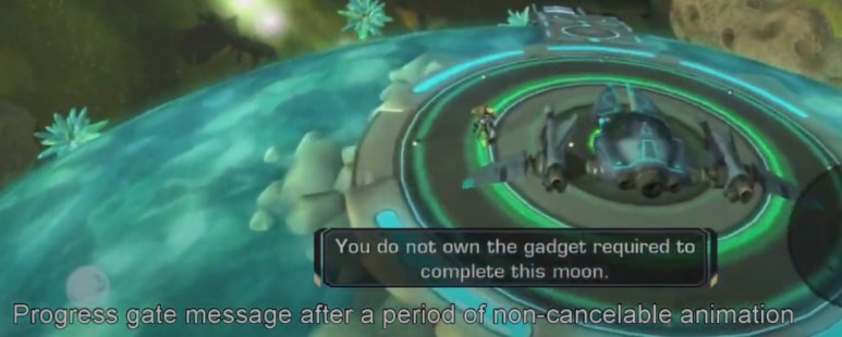 Full clip: https://youtu.be/OokWxEFT_q0
Moon Game Space Issues
Constructo Pistol blasts miss enemies that are medium-to-long distances away |
Cause: The blasts do not abide by gravity rules
Cause: The blasts do not abide by line-of-sight rules
Impact: Given that blasts honor world-rules in the Planet Game Space, the player may feel cheated by the lack of aiming confidence in the Moon Game Space.
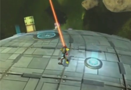
Full clip: https://youtu.be/sYU5odbG0ik
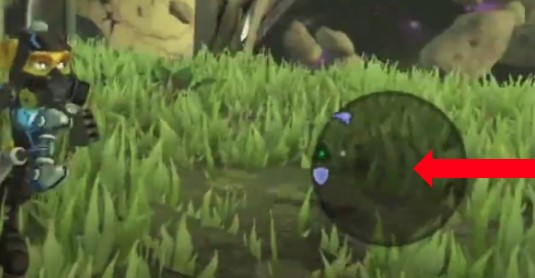
Navigation using the mini-map can be confusing |
Cause: Ratchet’s position on the mini-map is not explicitly stated
Cause: Congested areas with many NPCs and collidable objects exacerbates navigation difficulties
Impact: The player is unable to reliable determine proximity between Ratchet and any map marker
Full clip: https://youtu.be/1-Vq4u6Uetw
Meteor Pad prompts are missing from Ratchet sections |
Cause: The green Meteor Pad has visual similarities to acid traps from other platformer games (toxic green color, luminous, rising particles have a poison vapor appearance)
Cause: The green Meteor Pad lacks button prompts
Impact: The player hesitates to approach the Meteor Pad
Impact: The player is unnecessarily idle once stepping on the Meteor Pad
Impact: Player is less able to anticipate behavior of future unfamiliar launchpad types
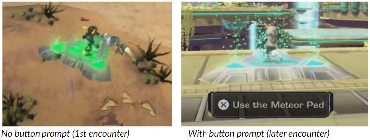
Additional info: The lack of Meteor Pad button prompts in Ratchet segments is further confusing when we consider that the same Meteor Pads do have button prompts in Clank segments (see screenshot above right).
Full clip: https://youtu.be/4tCXpzMljsw
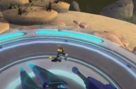
The sandy environment of Phylax Beta is difficult to read as a danger |
Cause: The color of the sand trap is very similar to the color of the adjacent safe platforms
Cause: The sand appears to be still when Ratchet is moving
Impact: The player may incorrectly register the sand as a static (safe) environment
Impact: The player may feel like a sand trap death is unfair
Full clip: https://youtu.be/haRLngNjyNA
Other Issues
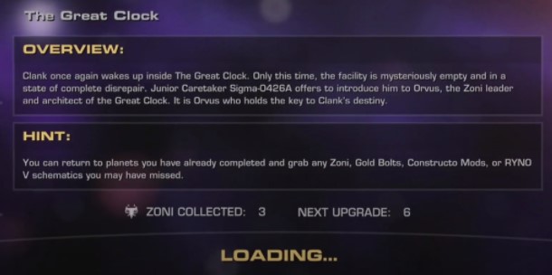
Loading screen lore and mission data may not be readable by some players |
Cause: Once the game data has been streamed, the loading screen immediately transitions to the game space
Impact: The player may become frustrated due to being unable to finish reading the text
Impact: The player is unable to control the duration of loading screen lore and mission data
Full clip: https://youtu.be/ATniyoFNB4E
Follow-Up and Next Steps
Recommendations for Next Steps
- Workshop potential solutions to the issues identified in this report
- Development team to ask any follow up questions
- Usability reviewer to join workshop to add usability insight and best practices
- Usability Reviewer to re-review once the issues have been addressed
- Run playtests on the game build following completion of #2 above. These user playtests will identify further usability issues.
Thank you!
caleb {at} calebjross {dot} com
Presentation format has been adapted from Steve Bromley’s “What’s in a games user research report?” article.
